
“Make it easy and secure for scuba divers to locate the perfect partner to dive in the USA.”
Gonzalo, Associate Director of Experience Design
Summary
During my interview with Verizon, I was asked to create a mobile app concept called "Buddies" to connect compatible and sufficient divers in the USA. As a result, my compelling designs led to me being selected for the UX Designer II role at Verizon.
Team
UI/UX Designer - Stefanie Torossian
Verizon Interviewer - Gonzalo
Role
User Research: Competitive Analysis, HMW Statements, User Persona, User Flow
UI Designer
Branding
Duration
4 days
Tools
Figma
Analyzing Existing Scuba Diving Apps
To get started, I first began examining scuba diving-related apps on the app store to analyze their key features, reviews, and ratings. I learned that these are the following desired features among divers:
✿
Logbook Functionality
Keep a detailed log of their dives, including locations, depths, and personal notes.
✺
Diving Certificate Verification
Verify and display their diving certifications directly within the app.
✻
Ability to Connect With Other Divers
Connect with a community of divers to share experiences and discover new diving spots.
✱
Share Diving Gear Information With Others
Share their diving gear with the community to help others get equipped for their dives.

Analyzing Direct Competitors
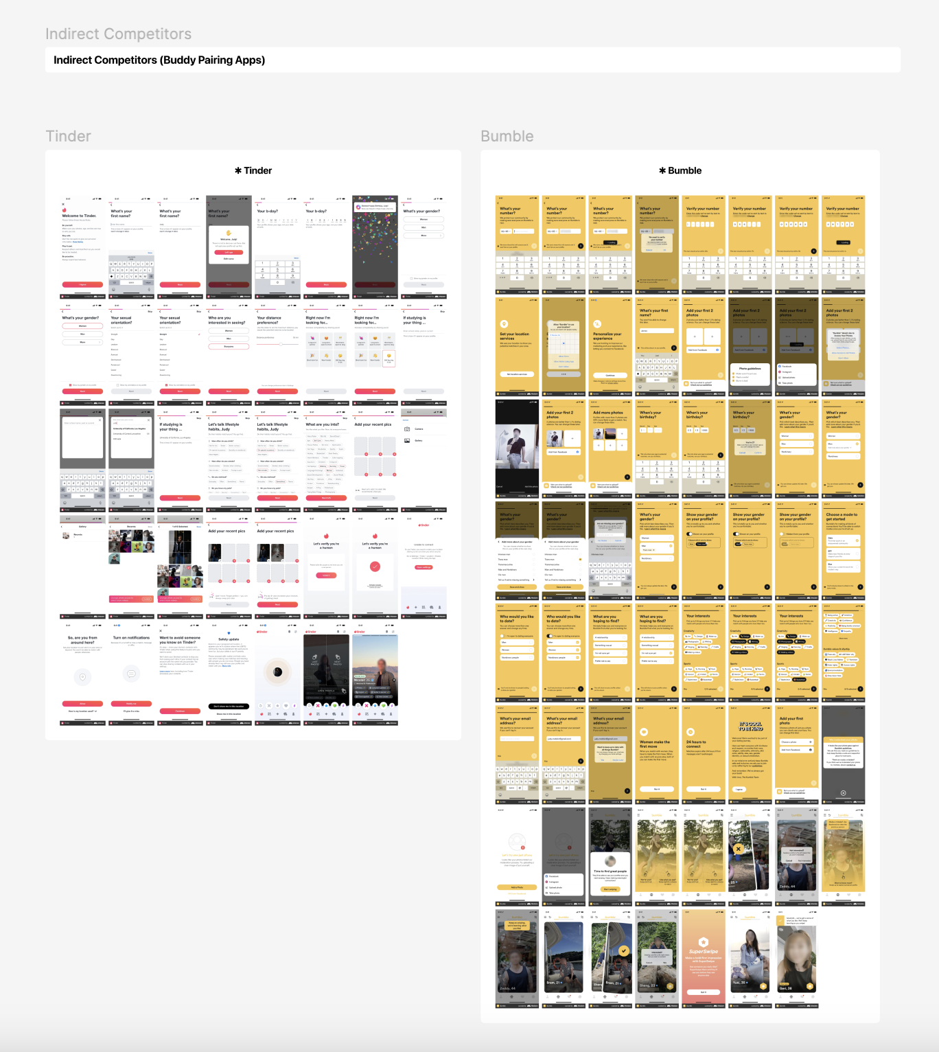
Examining Pairing Apps
Ideating App’s Core Features
There were many challenges I wanted to address during the ideation phase, such as how to pair scuba buddies together, how to create a safe community within the app, and how to keep suitable scuba buddies matched. After coming up with a list of questions and various solutions, I decided to implement the following features:
Include detailed user profiles that have their certification, diving experience, and more
Follow the swiping method to pair divers together
Require certificates to get verified by their diving organization and allow divers to rate each other to promote safety in the app
Include detailed information about each dive site
Include a logbook where users can record their dives
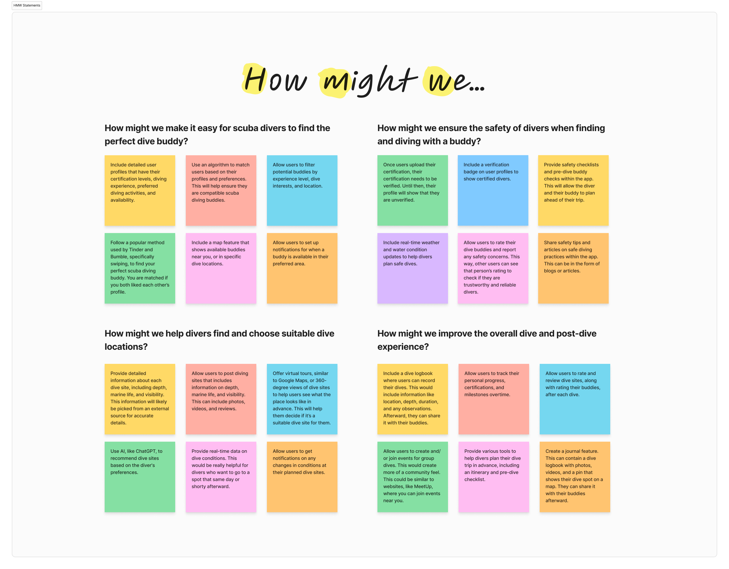
How Might We Statements
Afterward, I created a user persona to capture the insights I gathered through my competitive analysis, which allowed me to easily reference it when I started to design the app. These are the key points I conveyed:
Find the perfect diving buddy to share underwater adventures with
Discover suitable diving spots that he and his buddy would like to visit
Log his diving adventures into an app and share pictures/videos

User Persona
Establishing the App’s Flow
After developing the user persona, I created a user flow to visually demonstrate how these key features integrate into the app. The user flow addresses the following points:
Create an account
Onboarding and profile setup, including filling out your diving experience and adding certificate(s)
Swipe through the diver’s profiles and get a match
Begin chatting and start looking at dive spots to share with your new dive buddy
After your dive, log it into the app as a journal entry
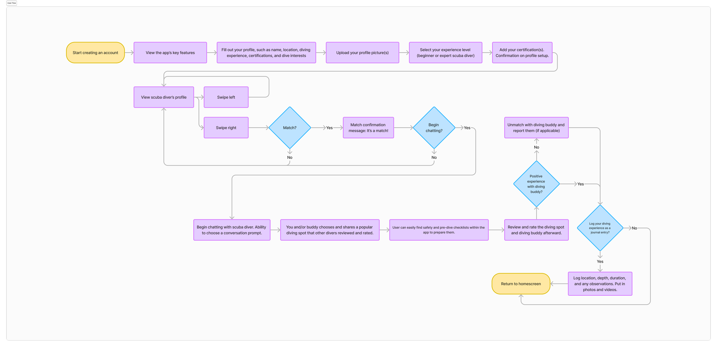
User Flow
Creating Low-Fidelity Wireframes
I created numerous low-fidelity wireframes that incorporate most of the user flow I created previously. This includes the key features, verification, onboarding, matching, and diver’s profile screens.

Low-Fidelity Wireframes
After making the wireframes, I started to look for design inspiration by creating a mood board. I used Pinterest to start looking for design inspiration and to understand color palettes that would be suitable for a diving demographic.
Many websites related to diving incorporated dark blue colors, which relate to the color of the ocean at a certain depth. This is likely what divers see, which inspired me to use a similar dark blue color palette for this app.
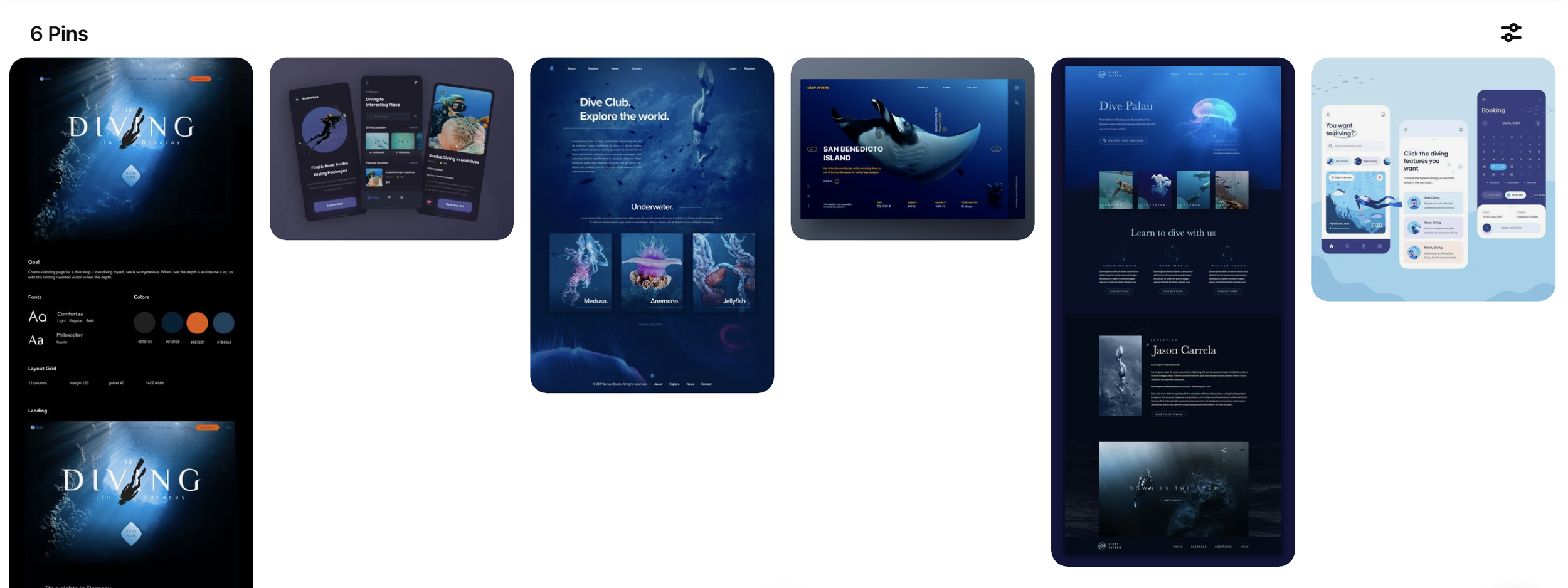
Mood Board
Establishing the App’s Brand Guidelines
For the brand guidelines, I chose the San Francisco font for body text and the NY font for headings, as recommended by Apple for iOS apps, to ensure users would see a familiar font pairing. I used Apple's SF symbols for iconography to maintain a cohesive appearance with simple and intuitive icons. For the color scheme, I selected hues that divers often encounter, specifically dark blue, light blue, and yellow. I followed the 60-30-10 rule, making dark blue the dominant color, light blue the secondary color, and yellow the accent color.

Brand Colors
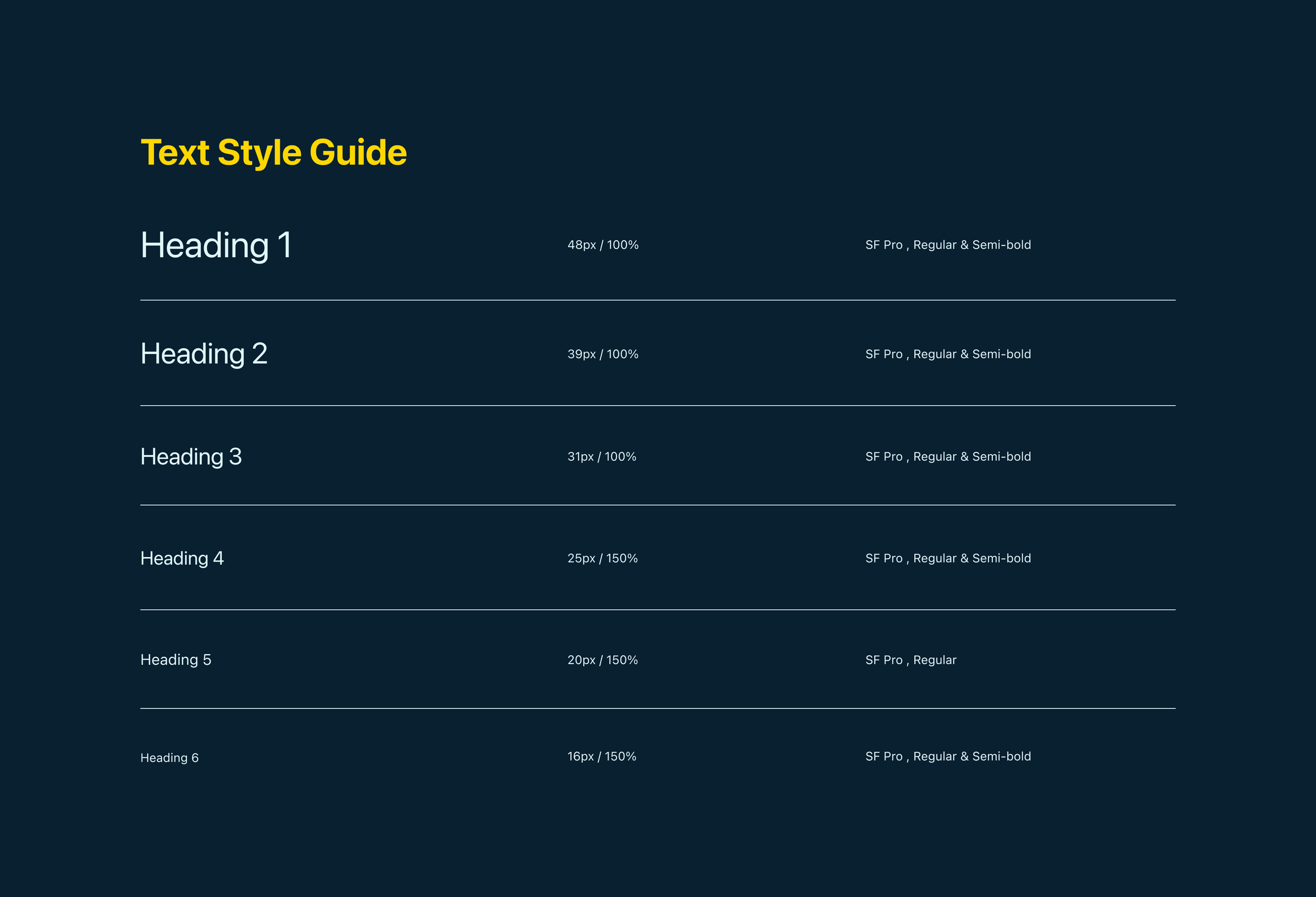
Text Style Guide
Creating High-Fidelity Wireframes
Using all the insights I gained from the competitive analysis, HMW statements, user persona, user flow, and mood board, I created numerous high-fidelity wireframes to show the key screens of this app. This includes how scuba diving buddies are paired, what the conversation screen looks like, how they can search for nearby diving locations, and how they can log their dives within the app.


Diver’s Profile
Match Screen

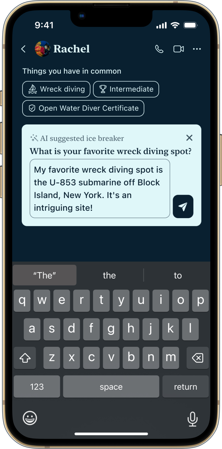
Message Prompt
Filled In Message
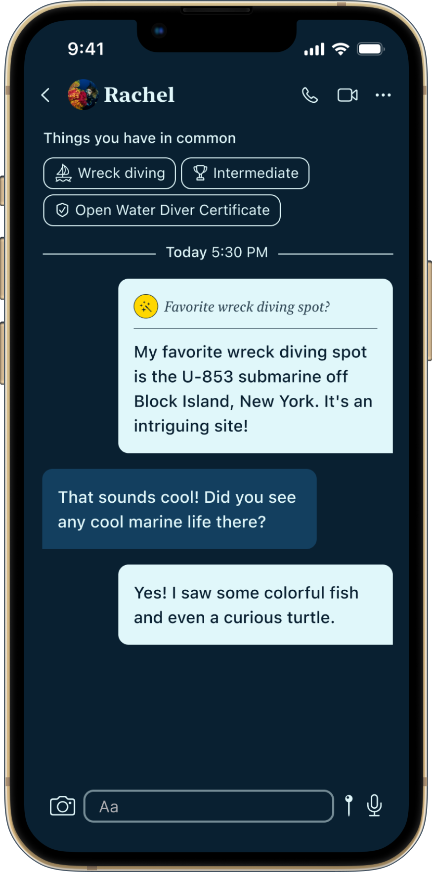

Conversation
Search Dive Site


Dive Site Info
Share Dive Site


Message Buddy Dive Site
Post-Dive Message


Log Recent Dive
Journal Entries


Share Journal Entry
Share Journal Entry
Prototype
I created a prototype to showcase the app’s flow and how the key screens all tie together, specifically how divers get matched, how they can search for a dive site, and how they can log their dive as a journal entry.
App Prototype
Conclusion
This was a wonderful experience that strengthened my skills in app design. I learned about referencing iOS branding to create a familiar design for iPhone users. When I presented the app design to the Associate Director of Verizon, as part of a design exercise for an interview, Gonzalo loved the designs. He thought I presented the app’s flow clearly and that the app designs were done professionally. As a result, I was selected for the UX Designer II role at Verizon.