"I dislike all of our original website. It's aesthetically a mess and it doesn't represent our brand very well."
~ Owners of Geniecast
Summary
The owners of Geniecast, a video production business that creates virtual event solutions, wanted their website to be redesigned and rebranded to match their values and business goals.
They disliked their existing website because it is cluttered, disjointed, and does not represent their brand. They wanted their website design to reflect their sophisticated services and advanced technology.
The project manager and I spoke with them about their brand identity and design inspiration to understand the design elements, visuals, and imagery they would like to see on their redesigned website. The key call-to-action button they wanted users to click on most frequently is to request an expert.
Challenges
The client's current website has a cluttered appearance where each website page leads to a separate tab, which may frustrate users and result in an increased bounce rate. Their website does not highlight their main call-to-action button, which is to request an expert.
Team
UI/UX Designer - Stefanie Torossian
Project Manager - Jessi Davidson
Website Developer - Trisha Johnson
Website Development Manager - Geoff Reis
Content Manager - Katie Palmer
Role
Client Design Facilitator
UI Designer
Visual Identity
Branding
Duration
2 weeks
Tools
Adobe XD, Adobe Photoshop
What I do.
-
I worked directly with the client to facilitate a design discussion. I led the client through a questionnaire to gather information about their target audience, website goals, and design preferences. This insightful session formed the foundation for the rest of the design process.
-
I began by creating low-fidelity wireframes in Adobe XD to establish the core layout of the client’s homepage. After finalizing the layout, I moved onto the high-fidelity wireframe to incorporate visual elements, such as imagery and brand elements that align with the client’s vision.
To ensure client satisfaction and project alignment, the project manager then facilitated client feedback through email communication, presenting the high-fidelity mockups through a shareable design link.
-
Leveraging the client conversation and inspiration websites (Apple, Vanyer Speakers, Bizzabo, Swapcard, and Hopin), I used this information to create a more intuitive user experience with subtle animations.
Research
During the kick-off call with Geniecast, I facilitated a design discussion to uncover their brand identity and vision. This session revealed several key insights:
✻
✱
Modern and User-Friendly
The client envisions a website that incorporates subtle animations, clean typography, a clear user flow, prominent social media links, layered graphics, rounded design elements, and an overall uncluttered aesthetic.
Design Inspiration
The client finds inspiration in websites known for their sleek design, user-friendliness, and innovative features, specifically Apple, Vanyer Speakers, Bizzabo, Swapcard, and Hopin.
✺
✿
Website Goal
The primary objective is to simplify the user experience, making it easier for potential clients to navigate the website and understand the offered services.
Target Audience
Their audience ranges from mid-size to large corporations (think L'Oreal, Target, and Credit Unions).
Ideation
After receiving the homepage content headings from the copywriter, I translated them into a visual framework through initial layout sketches. This exploration process prioritized a user-centered approach, ensuring clear calls to action. The "Request an Expert” CTA is prominently positioned at the top of the page to facilitate user engagement and fulfill the client's business goals.
Navigation, Hero, and Value Proposition
To maximize user engagement, the "Request an Expert" call to action (CTA) is prominently placed at the top of the page. The hero section reinforces this by communicating the business' value proposition: "Make Your Virtual Event Unforgettable." For users who need more information, the two sections following the hero delve deeper into Geniecast's offerings and key values, ensuring a clear and compelling user journey.
Event Solutions, Who We Work With
To improve the scannability and user experience within the "Event Solutions" section, I changed the lengthy content into a user-friendly checklist format. This allows visitors to quickly grasp the key aspects of Geniecast's services. Additionally, a slider was incorporated in the "Who We Work With" section to create an interactive element that fosters user engagement and potentially sparks intrigue in potential clients.
Design
Leveraging the initial layout sketches and existing brand guidelines, I translated them into high-fidelity mockups within Adobe XD. This process brought the client's vision to life by incorporating the following:
Professional & User-Friendly: The client emphasized a professional, easy-to-understand, and user-friendly website. I prioritized a clear navigation, prominent CTAs, and several images of their workspace and experts to establish trust.
Engaging Visuals & Micro-interactions: The client’s desire for a "young, vibrant, and fun" aesthetic, along with inspiration from websites like Bizzaboo and Swapcard, is reflected in my wireframe's use of color, visuals, and subtle animations to create a visually engaging and interactive experience.
Before I used a subtle micro-animation, I collaborated with a developer to ensure design feasibility. We explored various options and landed on using a GIF animation. This format allows the developer to easily integrate the animation into the code, enhancing the user experience without compromising technical implementation.
Homepage
Video GIF - Shows Client’s Work Setup
Revision
After speaking with the client and creating an interactive prototype, the client provided positive feedback on the overall direction and requested some specific refinements:
Color Change: Change the headline’s HEX color to match their flame visual element
Hero Section Emphasis: Increase the font size of the "Who We Work With" heading within the hero section for enhanced prominence.
Simple Design: Remove the extra graphics in the "Allow Our Experience to Speak for Itself" section
Testimonial Update: Remove Aramark's logo from the testimonial section.
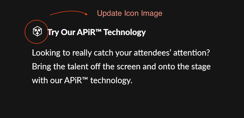
Branding Consistency: Update the button and accent color to their new HEX color, #E95125 along with the APiR Technology icon.
Request - Remove Background Elements
Request - Increase Font Size of “Who We Work With”
Request - Update APiR Icon Image
Updated Design
Once I made the edits above, the client approved the homepage design. They requested custom designs for two additional inner pages: "Health and Wellness" and "Virtual Event Solutions." Below, you can see a comparison of the "Before" and "After" homepage designs.
Before Revisions
After Revisions
Results
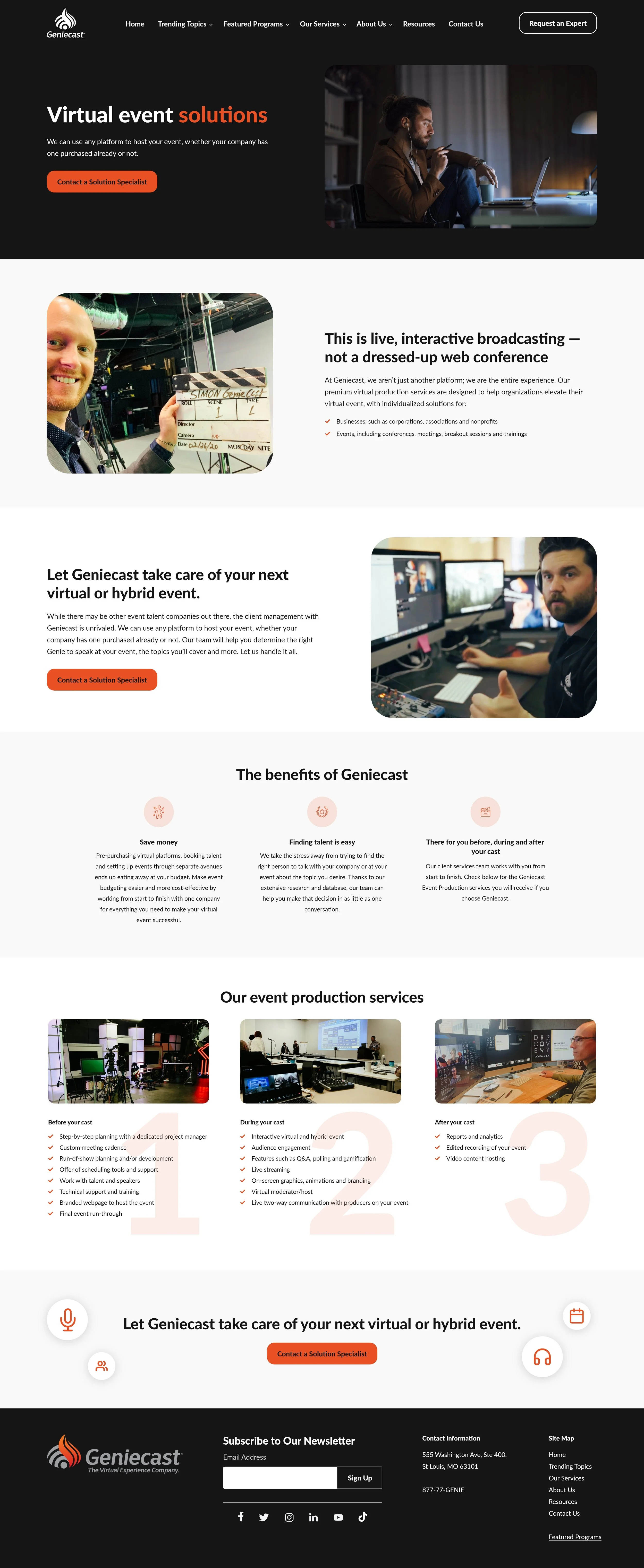
Following the client’s brand guidelines, I designed a consistent visual style for the "Health and Wellness" and "Virtual Event Solutions" pages. This ensured a unified visual experience for users navigating the website and reinforced the client's brand identity throughout.
Health & Wellness Page
Virtual Event Solutions Page
Revision
After sending the inner page designs to the client, they were pleased with it. However, they requested another minor revision for the homepage design: replacing a couple of images within the homepage video GIF. Once I made this change, they approved it and I handed off the designs to the developers.
To optimize the homepage loading speed, the developer suggested that I reduce the GIF file size. I made sure to shrink the video size before sending it to the developer.
Video GIF - Before Making Edits
Video GIF - After Making Edits
Conclusion
Designing Geniecast was a wonderful experience that allowed me to refine my website user interface design and prototyping skills. To ensure an efficient developer handoff, I uploaded all design files, including the images, components, fonts, and icons into a Box folder. Thank you for reading!


