
“I’d love to have some key action items, like questions, milestone, challenge in the bottom as opposed to the iconography in the bottom.”
Rosh, Usability Testing
Summary
Journey is a combination of a social media and habit tracking app that aims to empower users to develop healthy habits, achieve their goals, and become part of a close-knit community. The app provides users with a chance to keep each other accountable by posting their progress and steps.
Problem
Journey's user interface needed to be refined because the create-a-post flow was confusing. In addition, the founder of Journey wanted the design team to rebrand the mobile app and choose a color palette that would inspire users to accomplish their goals. As a result of redesigning the app, I improved the app rating to 4.8 and increased the number of app downloads to 1,000+.
Team
Stefanie Torossian: Usability Testing, Branding, Prototyping
Joyce Lin: Usability Testing, Branding, Prototyping
Kai Brooks: Usability Testing, Branding, Wireframing
Luke O'Brien: Founder of Journey
Role
User Research: Usability Testing
UI Designer
Visual Identity
Branding
Duration
3 months
Tools
Figma, Adobe XD
Approach.
-
I worked with the design team to conduct usability testing with five users. We gave them multiple scenarios and tasks to accomplish to analyze whether it was simple to navigate Journey’s app. For example, one scenario we asked participants was that they just completed a high-intensity interval training workout and we asked them to post two photos of their workout.
-
Once we conducted usability testing, I met with the design team to compare notes. We started discovering similarities in our participants’ responses and learned about their pain points when using the app.
-
Using the insights we gathered from our users, we developed an understanding of Journey’s target audience and began crafting a new brand identity for Journey. We wanted to motivate and spark excitement as users tracked heir progress in the app through Journey’s new brand guidelines.
-
After crafting a new brand identity for Journey with the design team, I began decluttering and simplyfing multiple screens, specifically the onboarding flow and guide page. In addition, I prototyped the new create-a-post flow to demonstrate its simple functionality.
Usability Testing
I conducted usability testing with 5+ users with the design team and founder of Journey. My role changed with each session, where I either actively spoke with the participant or took thorough notes on whether it was easy for the user to accomplish each task. Below is an example of a scenario and task we asked the users:
Scenario: You just completed an at-home HIIT (High-Intensity Interval Training) workout and would like to get tips on proper recovery.
Task: Share two photos of your recent workout and ask a question for recommendations on recovery.
Quote from Usability Testing
“I was just going to type in here, like ‘great HIIT workout.’ That’s a surprise to me where I am asked to write a question instead.”
Rosh, HIIT Workout Enthusiast

Virtual Usability Testing with Rosh Over Google Meets

Virtual Usability Testing with Alexa Over Google Meets
Synthesizing Insights
After conducting the usability testing, I gathered several key insights based on the similarities each user faced when navigating the app. In addition, I created a user persona and user journey map to capture these insights and reveal Journey’s target audience, which are hobby enthusiasts who want to track their progress overtime and become part of a close-knit community. Below are takeaways from our usability tests:
The iconography was unclear and confusing to users. Users did not know what each icon represented.
Users found it difficult to create a post because of the layout of the buttons.
Users preferred a more personalized experience.

User Persona - Fitness Enthusiast
Using the information the design team and I gathered, I created “How Might We” statements in FigJam to begin brainstorming solutions to the pain points that users had, specifically that users did not know what the icons meant, how to access their habits and journey information, and cluttered data showing their progress.

How Might We Statements
After we brainstormed and spoke with the founder about various solutions, we decided our main priorities would be:
Simplify the Icons: Select icons that are much simpler and easy to understand to ensure all users can instantly know what it conveys.
Contextualize the Plus Icon in the Create-a-Post Screen: Change the “+” icon in this screen to “Add a Tag'“ to allow users to select what kind of post they want to create, such as question, step, milestone, and challenge.
Personalize Users’ Experience: In the onboarding flow, allow users to select communities they are interested in and their passions. Therefore, instead of seeing an empty feed as a new user, they would have already joined several communities and instantly be inspired by others.
In addition to these edits, we wanted to make additional edits that would further enhance the app and improve the user experience by including the following:
Simplify the Users’ Journey Data: Rather than putting in too much information into this page, we want to capture just the essential data to show their activity trends and progress.
Introduce a Calendar: Visually show which days the user logged their activity through a calendar and a checkmark icon. This way, the user will not need to scroll through a lot of information to check when they completed that activity.
Redesign the Guide Page: Currently, it is very text-heavy and does not contain enough visuals to captivate users. The goal is to simplify this page and add visuals to convey the guide’s journey, recent photos, key milestones, types of resources, habits, and challenges.

User Journey Map
My Role
Make the onboarding flow an interactive experience, redesign the guide page by adding more visuals, and prototype the create-a-post flow.
Sketching a New Layout
To explore potential layouts for the redesigned app, I created a series of sketches focusing on different screens within the app.
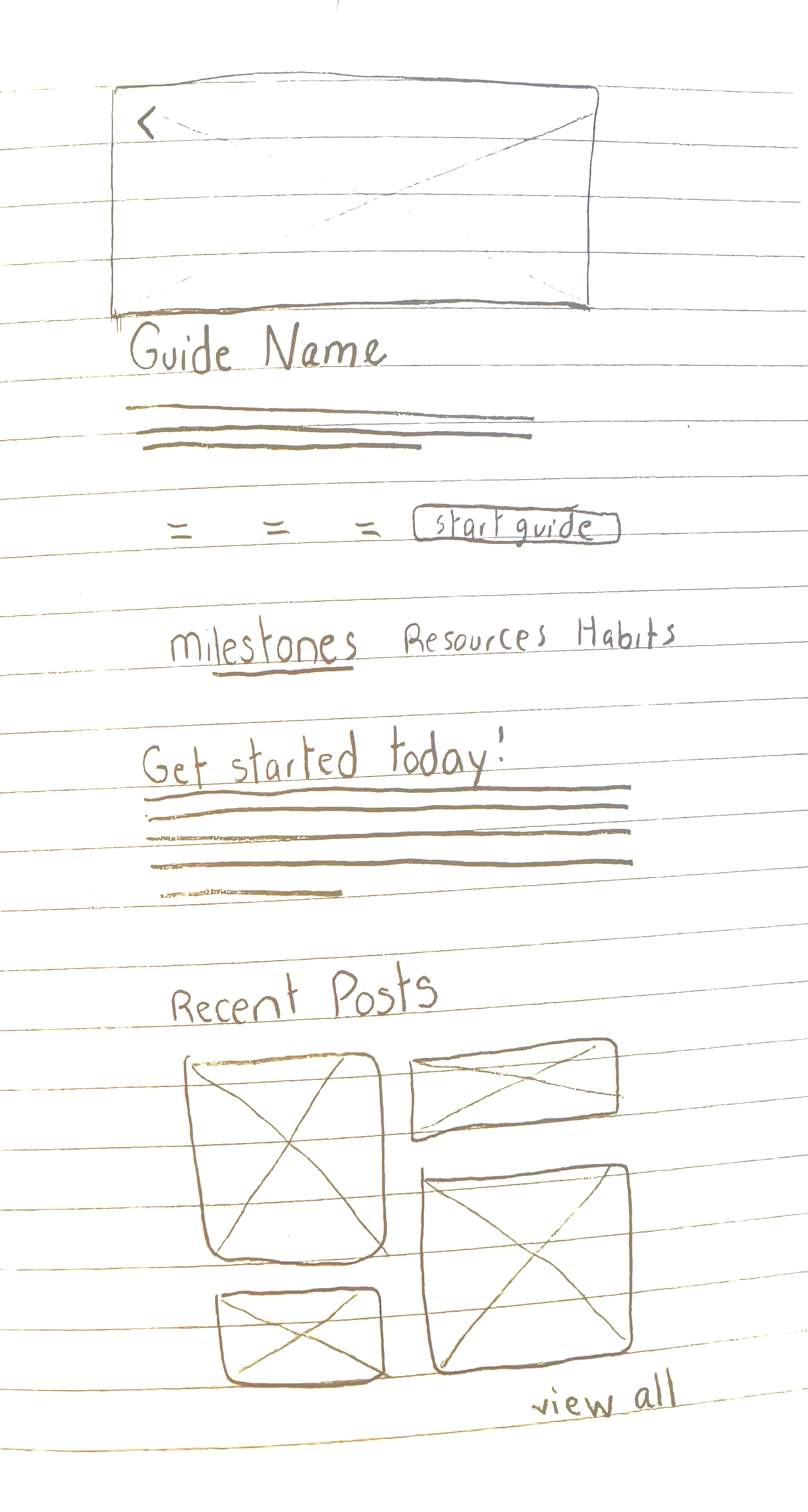

Guide Page (First Screen)
Guide Page (Second Screen)
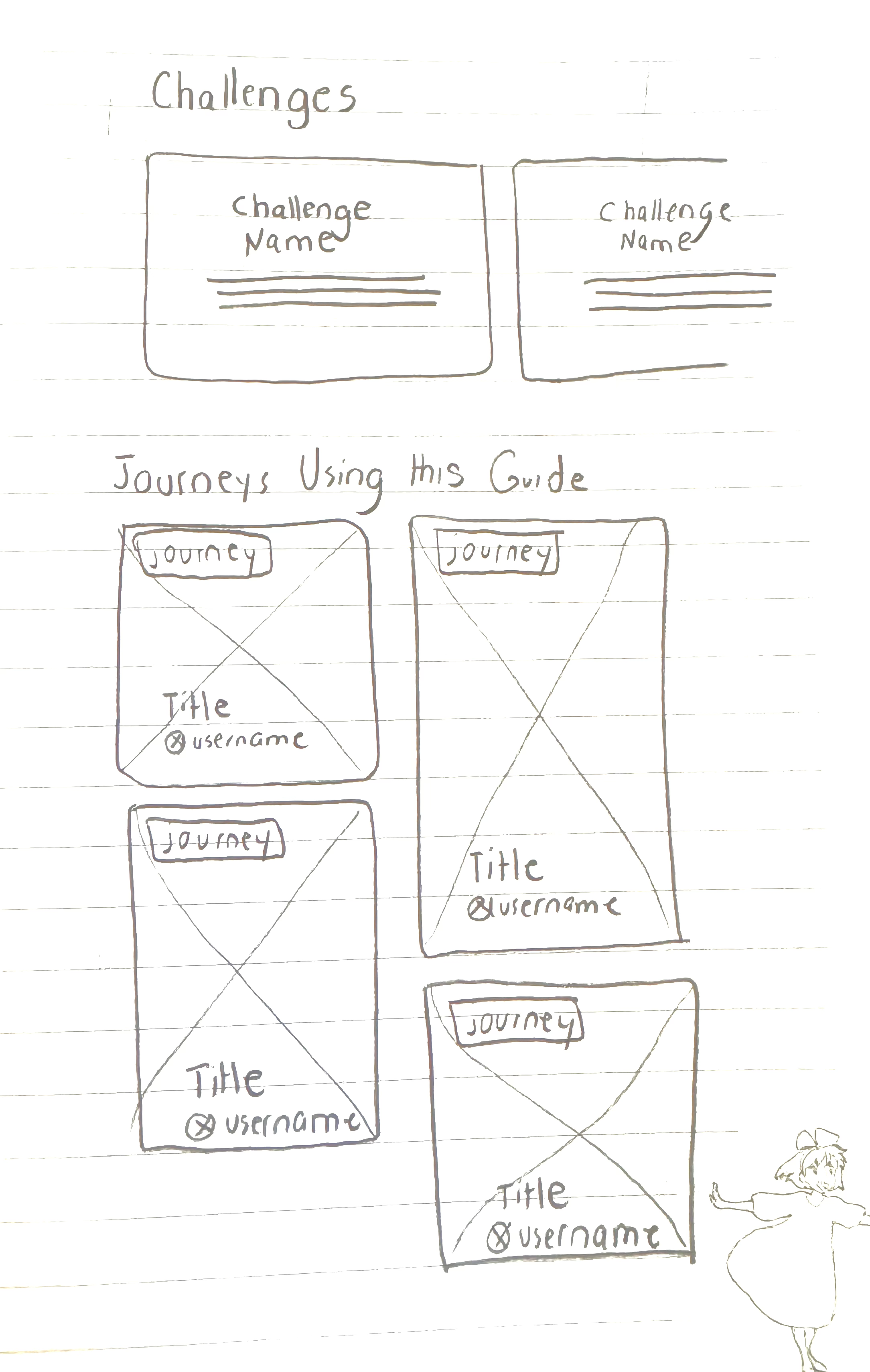

Guide Page (Third Screen)
Create a Post
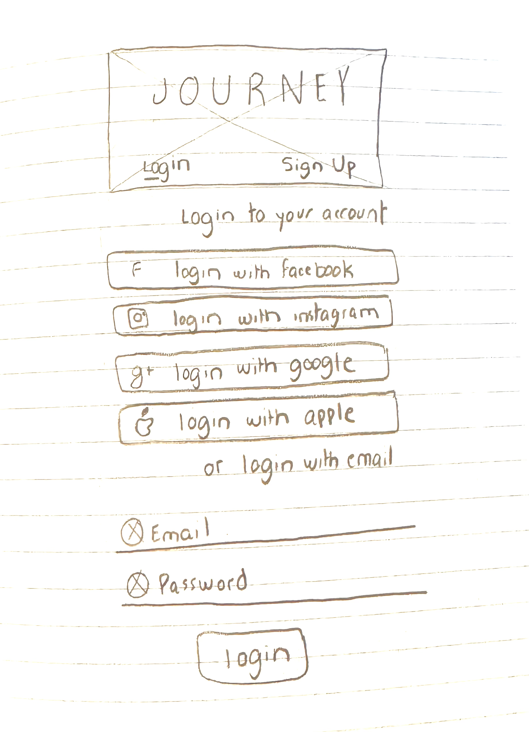
Onboarding (First Screen)
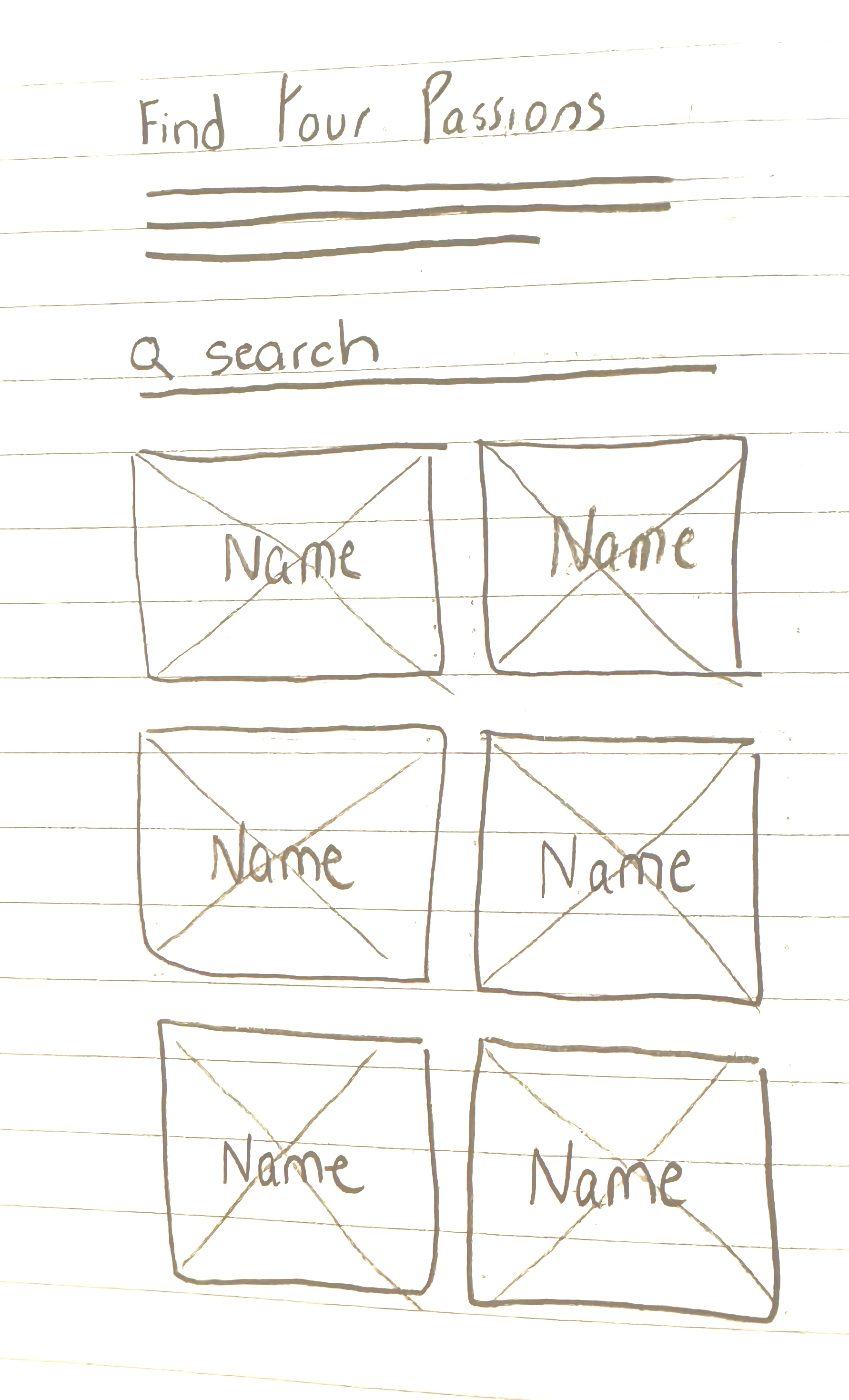
Onboarding (Second Screen)


Onboarding (Third Screen)
Onboarding (Fourth Screen)
Understanding the User Journey
After creating sketches of each set of screens, I created a user flow to better understand what users will experience in the redesigned screens. Below is the user flow for the login, signup, and onboarding flow.

New User Flow: Login, Signup, and Onboarding
Afterward, I designed the new create-a-post flow on FigJam to show how users will experience the new flow with my iterations and redesign.
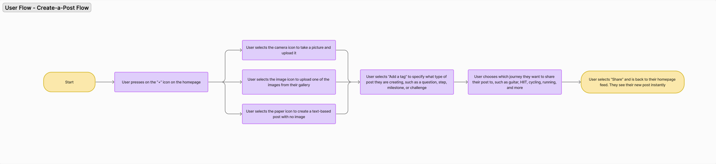
New User Flow: Create-a-Post
Brainstorming the Brand Identity
The founder desired the redesign to evoke the feeling of a beautiful journal, one that excites users to track their progress and celebrate milestones. Keeping this in mind, the design team and I created our own designs showcasing a variety of color palettes and visual styles to present to Luke afterward.
“I want this app to look like a beautiful journal that highlights your milestones”
Quote from Luke, Founder of Journey

Exploring Journey’s Brand Direction
Finalizing the Brand Guidelines
After the founder reviewed the wireframes from the design team and me, he opted for a dark theme with gradients. This direction aligned with the concept of a clean and sleek journal along with current user interface design trends. The design team and I finalized the design guidelines by selecting Montserrat as the standard font and incorporating light and dark gradients to evoke a sense of inspiration and excitement for users.
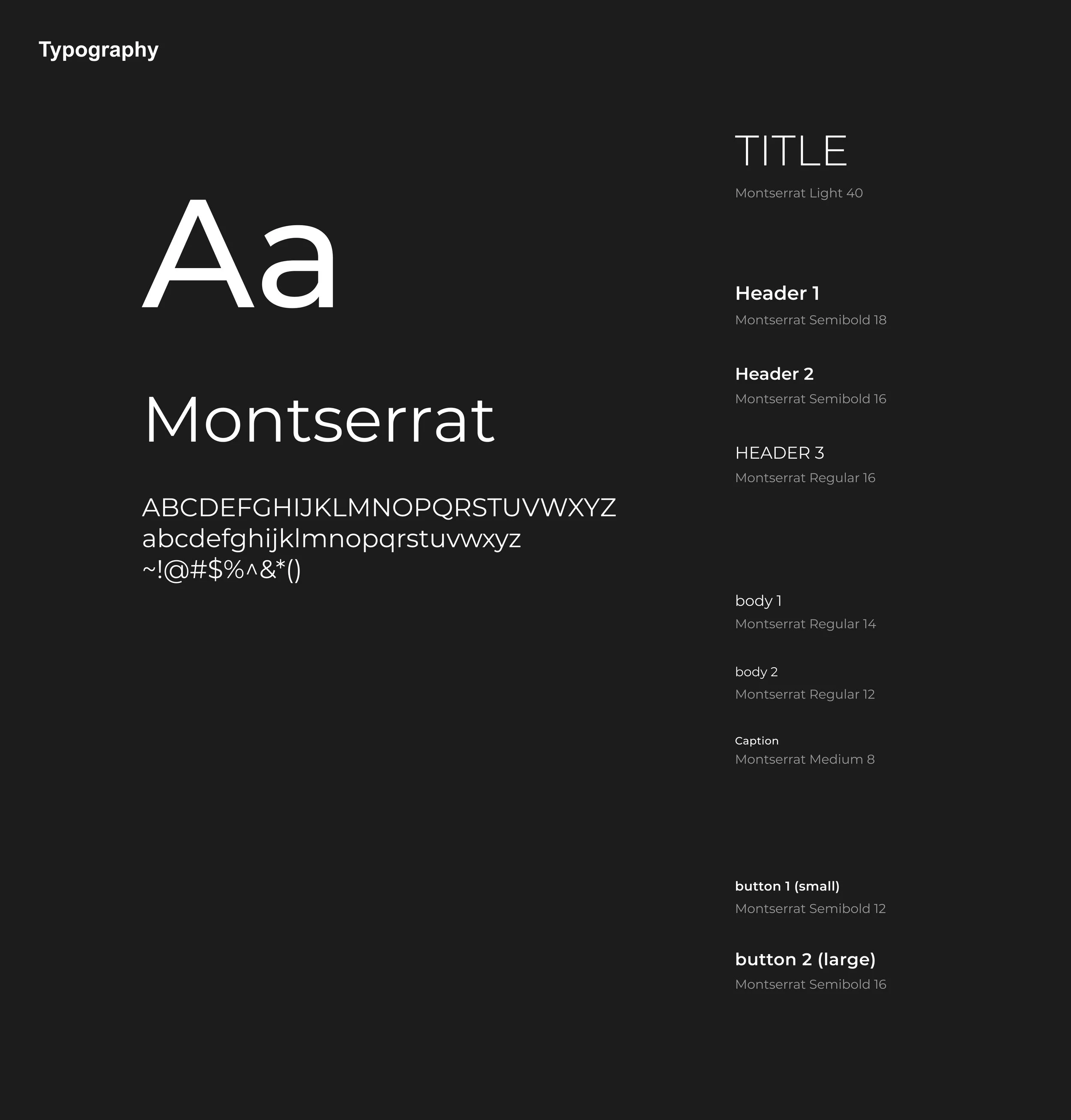
Brand Typography
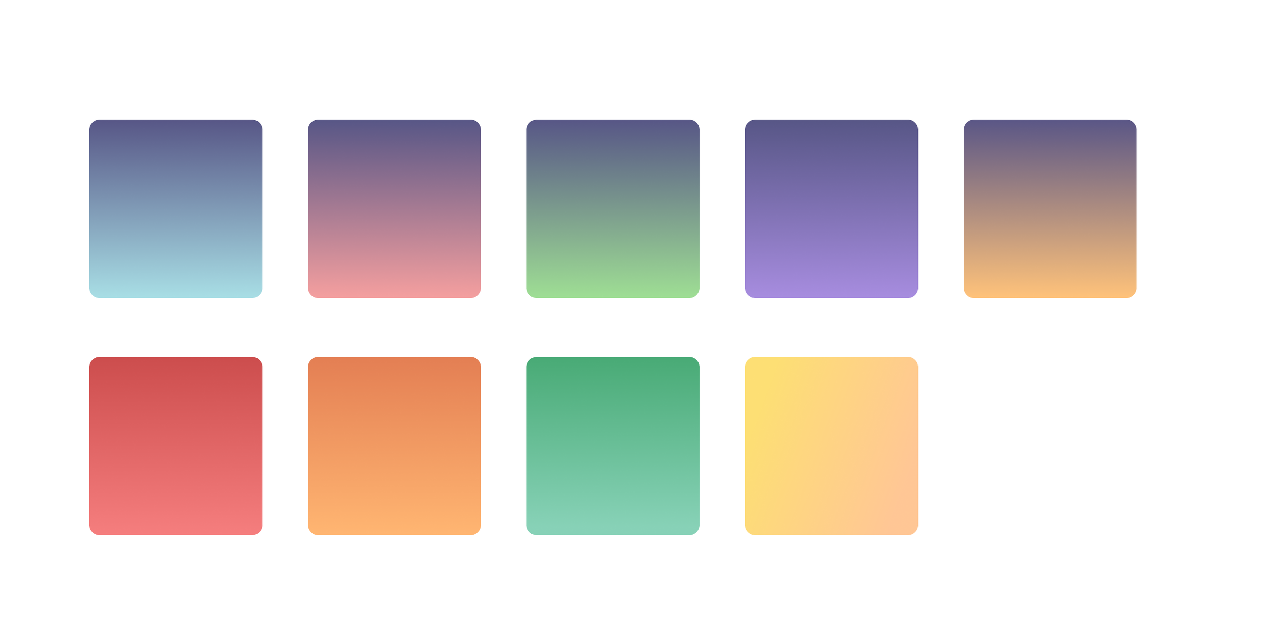
Brand Colors
Results
I created several wireframes following Journey's new brand guidelines, specifically the guide page, make-a-post screens, and onboarding screens. Afterward, I created a prototype for each of these pages to show its functionality.
Guide Page - Prototype
Guide Page
In Journey, guides are known as experts in a particular field, such as skydiving and snowboarding, that users can learn from and feel inspired.
Initially, the guide page appeared cluttered and disorganized. In my redesign of this page, I made it more visually intriguing, improved the navigation of the page by creating a menu consisting of each section that users can press on, and created different box designs to make each section feel unique and personalized.
When prototyping this page, I created a variety of animations for each section to make it an enjoyable experience for users as they scroll down the page.
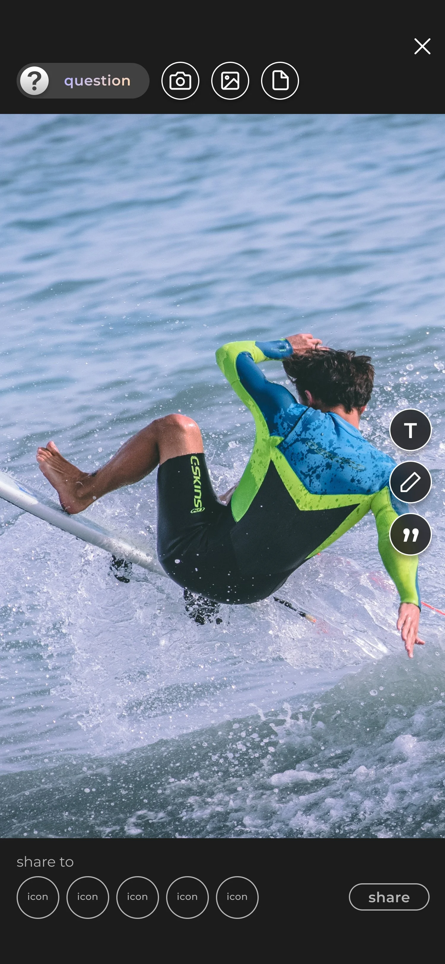
Create-a-Post: Prototype
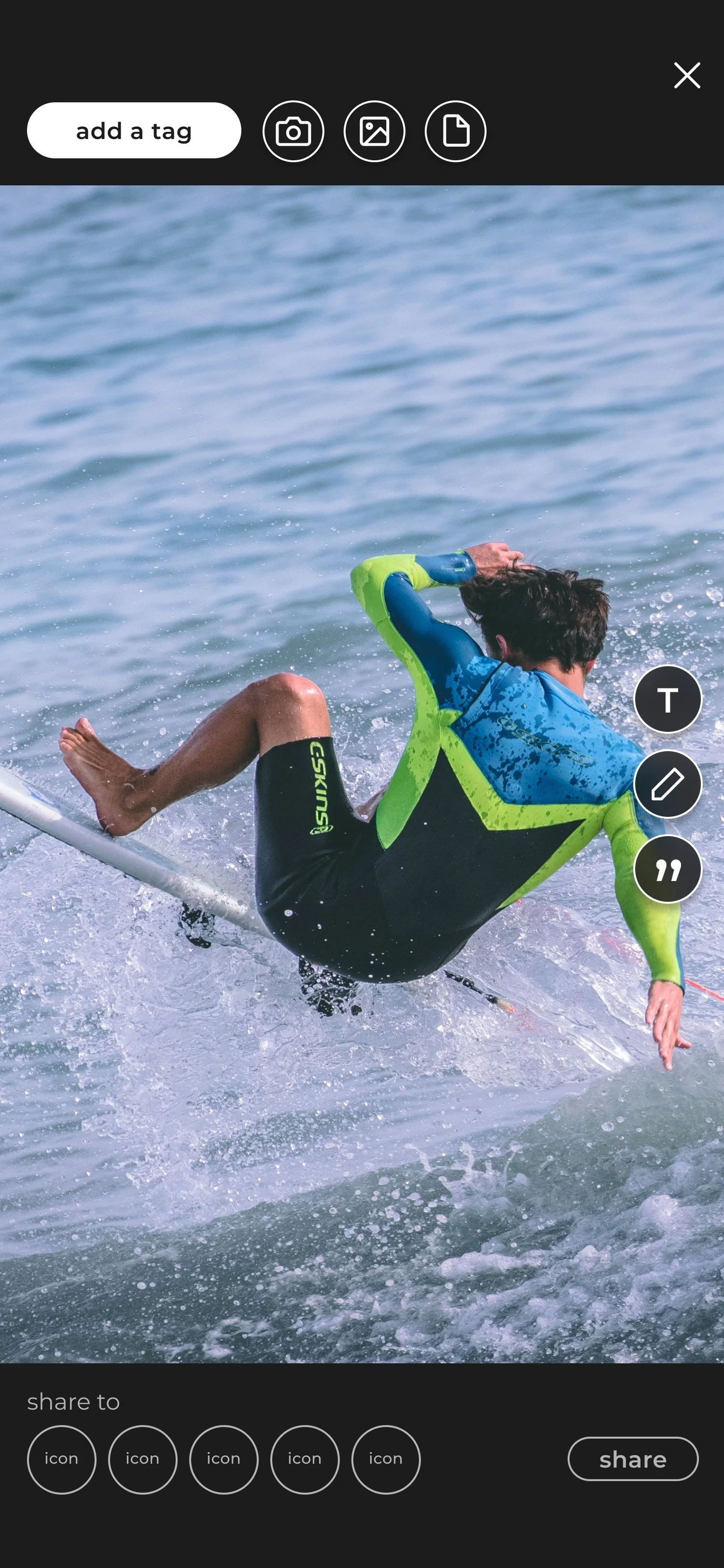

Create-a-Post
Create-a-Post: Add a Tag

Create-a-Post: Community Chosen
Create-a-Post: Tag Selected
Create-a-Post Flow
A pain point users experienced during our usability tests was that making a post was a confusing process because of the unclear plus button and placement of information. A design team member handed off this design to me so I could prototype it. I ensured the prototype consisted of a dropdown selection when users chose a tag, sliding animation when a user selects the text or color icon, and highlighting the community icon they selected by adding a thick gradient border around it. This ensures a user-friendly experience that validates each user action.


Login/Signup
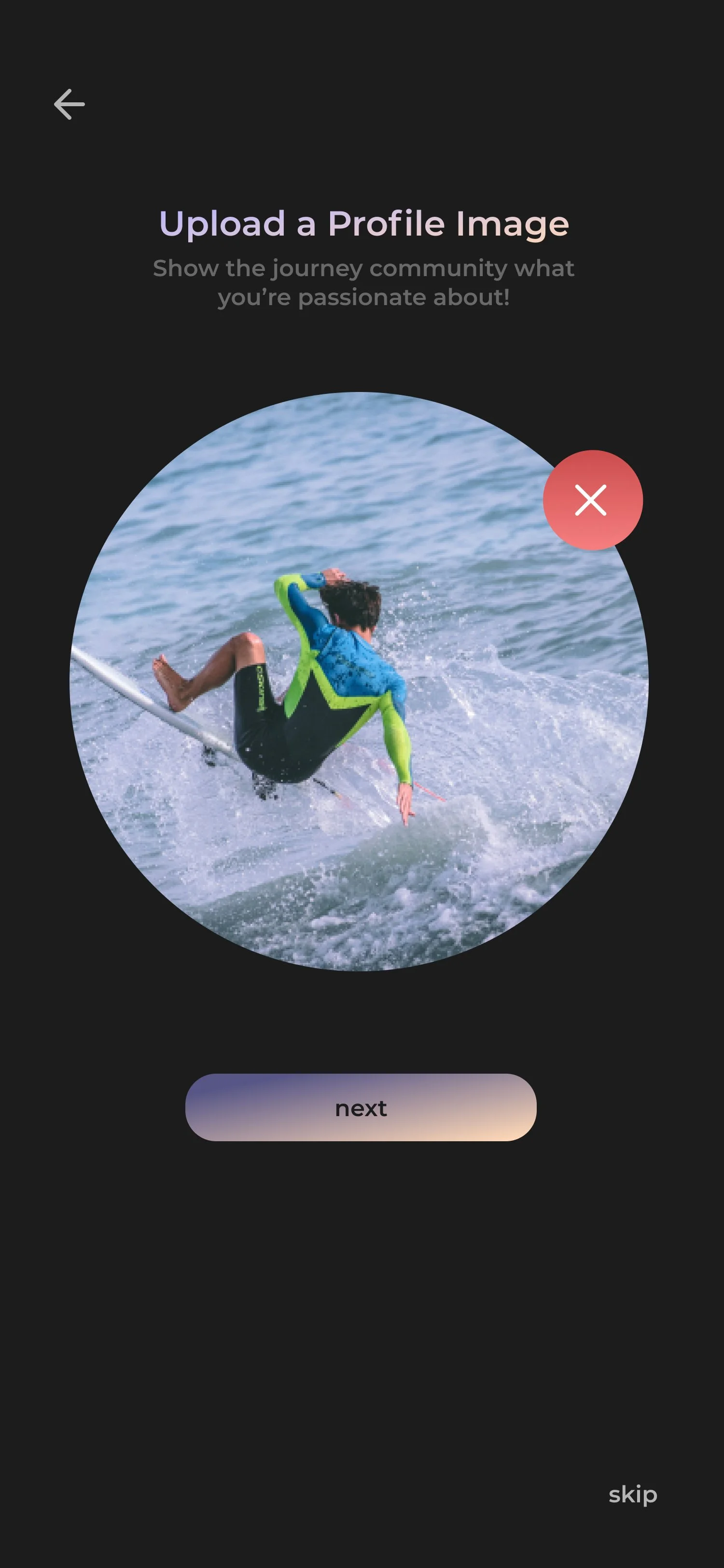
Signup: Upload a Profile Image
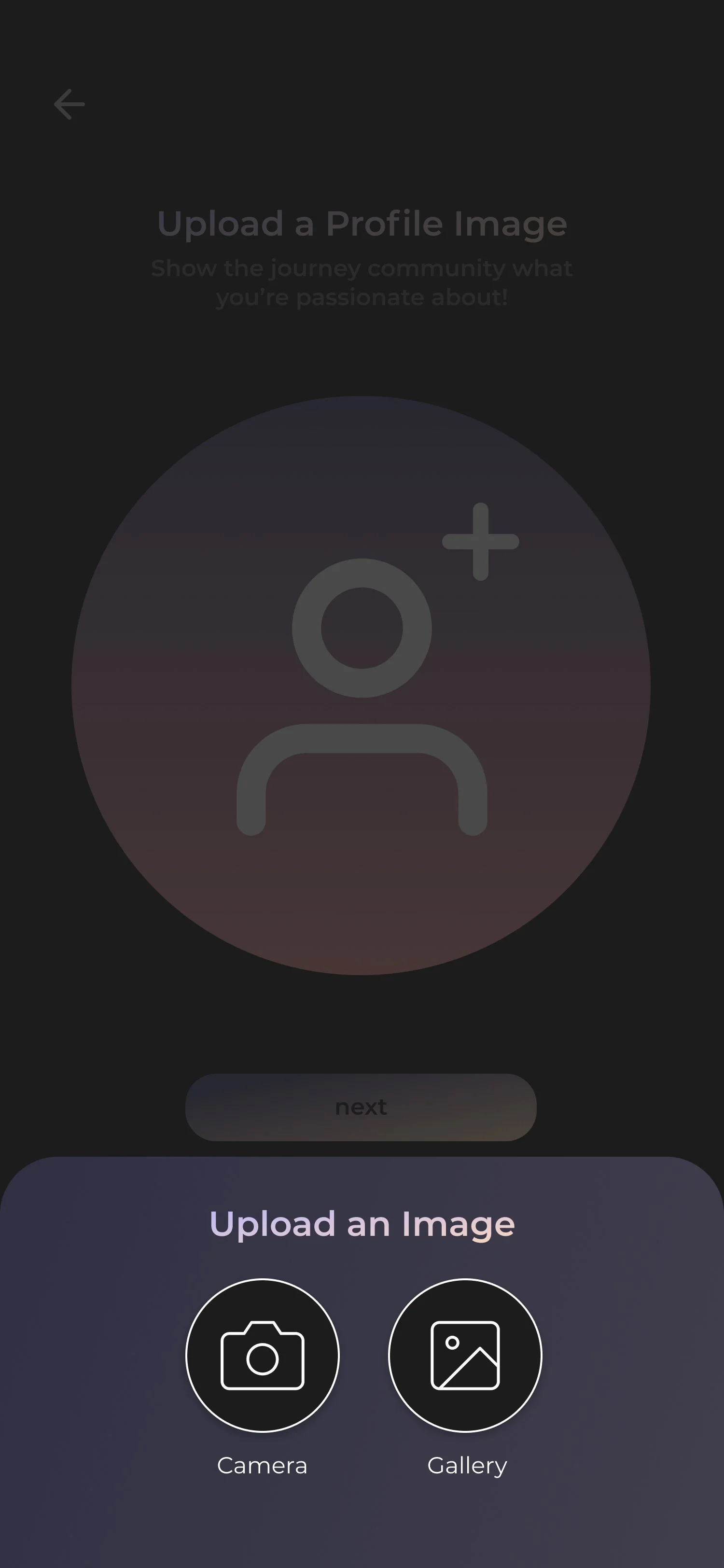
Signup: Camera/Gallery
Signup: Photo Uploaded

Signup: Final Step
Login/Signup and Onboarding Flow
Login/Signup and Onboarding Flow
I redesigned the login/sign-up flow to inspire users to embark on their journey using the app. The login/sign-up screen shows a cover photo and Journey's logo to represent the adventure they're about to embark on.
Once they sign up, I provide a personalized experience where they can choose the categories they are most passionate about, current journeys they would like to follow, and a journey they would love to embark on.
Conclusion
This internship helped me grow immensely as a designer by teaching me about collaborating cross-functionally, creating visual designs that strengthen a brand, and prototyping a user interface to demonstrate its functionality.
Unfortunately, I was unable to collaborate with the development team because I had my internship for a short time. However, I ensured an efficient developer handoff by uploading all design files, such as icons, images, and assets into a shared digital folder. As a result of my design work, Journey's app store ratings improved to 4.8 with 1,000+ downloads. If I had more time to work on the designs, here is what else I would work on:
Conduct another set of usability tests to determine how intuitive and simple the redesigned app is to navigate, specifically the create-a-post and onboarding flow
Refine the app designs further based on feedback from the usability tests
Thank you for reading!